Wow, this is a good one!
When you specify a URL as a link in an anchor tag, you should be sure to
specify a valid, and properly formed URL.
The mistake that Allison submitted refers to the mistake of omitting the trailing
slash (/) at the end of any URL which refers to a directory (defaulting to the file
index.html in that directory) rather than to a specific file.
Consider the following URL:
This URL should load the file index.html from a subdirectory named classes. When the specified server receives this request, it will first look for a file named classes. Since the file does not exist, the server will return an error message to the browser. The browser will then automatically append a slash to the URL and send a second request to the server. This time, the request will be satisfied (assuming there is indeed a file named index.html in the specified directory).
The problem here, of course, is one of performance. The incomplete URL causes two server requests rather than one. This is slower (although probably not noticeably) on the client end, and it puts an unnecessarily heavier load on the web server.
We have no control over what URLs users type as they navigate, but we, as web designers,
can at least use complete URLs in our own code.
Be sure to use a complete URL, including a trailing slash if appropriate.
The improvement in performance may not be noticeable to the human eye, but
it will be a service to the internet as a whole.
Replace the URL above with either of the following:
We might go so far as to say go easy on all graphics of any type. We know that this is heresy to many web'sters, because we do know that color, pictures, and animation are eye-catchers. But as Mark submitted, "we know they're cute, but a little bit goes a long way."
Many of us do our web development using a high-speed internet connection and forget how slowly our pages will load via a dial-up line. We must remember that the vast majority of web users use dial-up lines, so we do need to remember to design accordingly. We also must remember, as Mark submits, that too much animation can be more of a distraction than a help.
Far too many web pages seem to have been developed with a sole focus on style, to the exclusion of content. This is similar to presentations that we might see, or reports that we might read, that are pretty, colorful, and have lots of bells and whistles, but they don't say anything. Web pages are no different: If you want repeat web traffic, you need to provide some content; style alone will not do the job.
Now, having said that, we all want a good-looking web page.
Color, animation, and many other features can help us achieve that goal.
We just want to heed Mark's suggestion: Take it easy.
Have you ever noticed that some pages display nothing but a blank screen during what appears to be the downloading process, yet other pages start displaying the text parts of the page almost immediately? You will sometimes notice that outline "boxes" are set aside for the page's images, and the text is rendered onto the screen very quickly. Then, after the text has been quickly rendered, the outline boxes are gradually filled in with the actual images. The advantage here is that the user gets to see all the text almost immediately rather than waiting until the images are downloaded before seeing any text.
If at all possible, you should use the Width and Height attributes of the Image tag. If you specify the height and width of an image, then the browser can simply reserve space for the image in the initial pass at rendering the page. If you do not specify the height and/or width of the image, then the browser must completely download the image file to determine its height and width so it will know how much screen area to set aside for the image.
Note: You might also consider using the Alt attribute of the Image tag as well.
The Alt value is displayed in the outline box before the image is downloaded,
and also in a floating box when you move the mouse cursor over the image after
it is downloaded.
The two primary image formats supported by browsers are GIF and JPEG. The JPEG compression scheme is called lossy because it permanently reduces the number of colors in an image to minimize the space required to save the image color table. Lossy compression is generally acceptable because the human eye can not distinguish very small color variations, such as the difference between a pixel with an RGB color value of #060606 versus #060607.
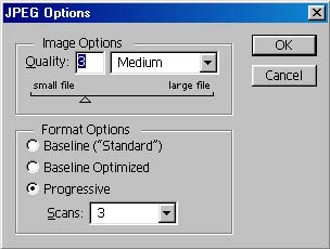 JPEG supports several different levels of compression.
In Photoshop 5.0 (shown to the right), there are ten levels of image resolution/compression.
Maximum refers to maximum resolution, which would be minimum compression.
That is, the image would be saved with very little (or possibly no) loss of
picture quality, but the resulting file would be only slightly compressed.
For faster downloads, you might want to consider Medium resolution/compression
as a good compromise.
(Note: all images in the Computer Tips use this option.)
It is true that the image quality is generally not quite as good, but in many
cases, it is good enough.
And the image files are significantly smaller, resulting in much faster downloads.
JPEG supports several different levels of compression.
In Photoshop 5.0 (shown to the right), there are ten levels of image resolution/compression.
Maximum refers to maximum resolution, which would be minimum compression.
That is, the image would be saved with very little (or possibly no) loss of
picture quality, but the resulting file would be only slightly compressed.
For faster downloads, you might want to consider Medium resolution/compression
as a good compromise.
(Note: all images in the Computer Tips use this option.)
It is true that the image quality is generally not quite as good, but in many
cases, it is good enough.
And the image files are significantly smaller, resulting in much faster downloads.
How often have you gone to a web page that was unreadable because the text was not visible over the background? It is generally recommended that you use a very light background, with dark text.


Click on each of the images here to see the effect of a lighter background.
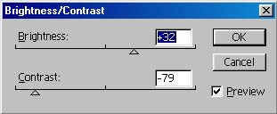
The image on the right was adjusted by increasing the brightness and reducing the contrast
(see the image below).